Navigation Architecture
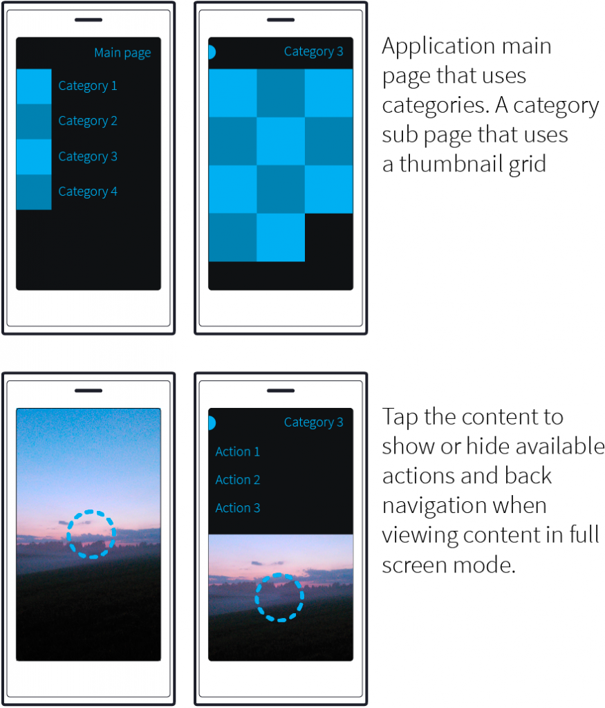
Compatible and simple hierarchyOn a mobile device, it’s crucial to break down complexity into a sensible and understandable form. Sailfish OS apps use pages to form a simple hierarchy that’s compatible with common content and application types. Special care went into harmonizing how horizontal touch gestures are used by applications. This saves development time and make it easier for new users to get up to speed with the app.
Application pages
When opening a new application page, it stacks up with its parent. Moving application page horizontally, user can navigate back to the previous page. When a single page is not enough, you can use an attached page. It’s another page that’s appended to the page stack, after the current one. You can access it moving the current page to the opposite direction (next page, instead previous one). If you’re porting an app to Sailfish OS, you can use attached page as a replacement for the “Hamburger/basement menu” or different sidebars.

Pulley menu
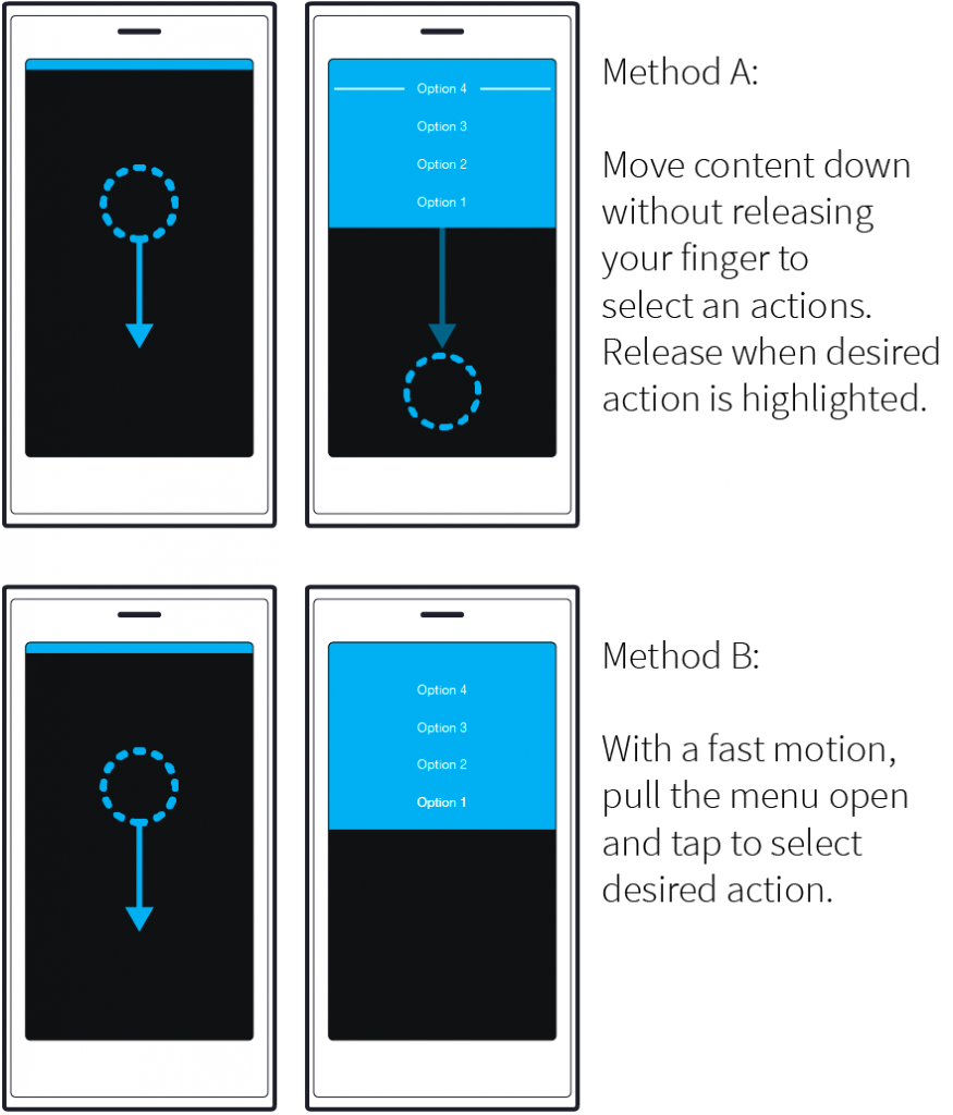
A pulley menu is an interactive extension of a page. It can be placed at the top or bottom of a page, and when user moves the content, the pulley menu is revealed. This pattern frees user from the need to reach a certain part of the screen to tap a touch target. Using a pulley menu depends of the distance between press and release coordinates alone. Keeping the number of menu options below five guarantees that the app works also in landscape orientation.

Dialogs
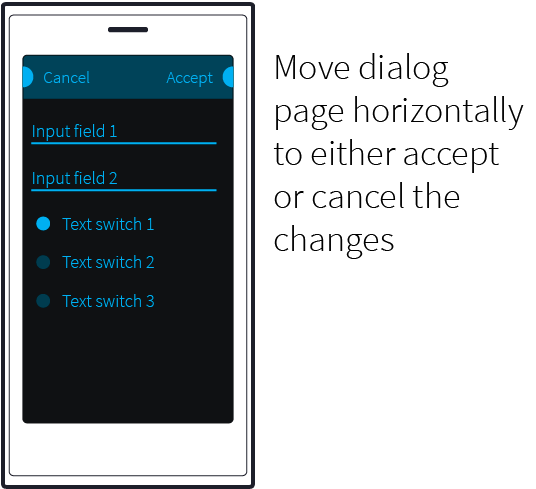
When you need user confirmation to a functionality, use a dialog page. It uses the page stack gestures to cancel or accept the dialog. User will go back to cancel, or forward to accept the changes presented in the dialog. Dialog page has a distinctive header to separate it from a traditional page. User is taken back to the parent page, after interacting with a dialog.
