API Documentation
Documentation for developing SailfishOS applicationsSailfish Application Features Common Pitfalls in Sailfish Application Development
Scaling Sailfish Application UIs
Using scalable layouts
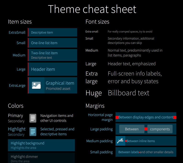
Sailfish Silica provides multiple tools for creating scalable application layouts. In general it is advisable to design applications so that they are composed of well defined, easy to scale UI components.
Using hard-coded pixel values should be avoided, and Silica Theme parameters should be used whenever possible.

If you still need to use a hard-coded pixel value you should use Theme.dp() function:"
 import QtQuick 2.0
 import Sailfish.Silica 1.0

 Rectangle {
     color: "red"
     anchors.centerIn: parent
     width: Theme.dp(100)
     height: Theme.itemSizeSmall
 }
You can also get the pixel ratio for the device from Theme.pixelRatio:
 Label {
     anchors.verticalCenter: parent.verticalCenter
     font.pixelSize: Theme.pixelRatio > 1.5 ?
     Theme.fontSizeMedium : Theme.fontSizeSmall
 }
Sometimes it is necessary to alter the application layout depending on the physical size of the display. This can be achieved by using the Screen.sizeCategory property:
 import QtQuick 2.0
 import Sailfish.Silica 1.0

 Label {
     text: "Hello world!"
     anchors.centerIn: parent
     font.pixelSize: Screen.sizeCategory >= Screen.Large
                     ? Theme.fontSizeLarge
                     : Theme.fontSizeNormal
 }
Should the application layout be more drastically different on different screen sizes it is good to write separate layout components for each and use the Screen.sizeCategory property to choose between the layouts.
In this kind of case it is important that the UI components of the application are easy to reuse from each layout, so that you don't end up copy-pasting code in each layout.
 import QtQuick 2.0
 import Sailfish.Silica 1.0

 ApplicationWindow {
     initialPage: Screen.sizeCategory >= Screen.Large
                  ? Qt.resolvedUrl("SplitViewPage.qml")
                  : Qt.resolvedUrl("ListViewPage.qml")
 }
Scaling graphical assets
The Sailfish platform icons have been scaled so that the sizes of the icons match the corresponding icon size definitions of Silica Theme.
Applications may provide their own graphical assets but in that case they will need to select the correct size variant depending on either Silica Theme (icon) size definitions or the Screen.sizeCategory property:
 import QtQuick 2.0
 import Sailfish.Silica 1.0

 Image {
     anchors.centerIn: parent
     width: Theme.iconSizeSmall
     height: Theme.iconSizeSmall
     source: closestMatchingIcon()
     sourceSize.width: width
     sourceSize.height: height

     function closestMatchingIcon() {
         if (width <= 50) {
             return "icon_50x50.png"
         } else if (width <= 100) {
             return "icon_100x100.png"
         } else {
             return "icon_200x200.png"
         }
     }
 }
If you want avoid dealing with size variants you can deploy the graphical assets in scalable SVG format.
 import QtQuick 2.0
 import Sailfish.Silica 1.0

 Image {
     width: Theme.iconSizeSmall
     height: Theme.iconSizeSmall
     sourceSize.width: width
     sourceSize.height: height
     source: "icon.svg"
 }
There are few caveats:
- Qt SVG only supports the static features of old SVG 1.2 Tiny standard
- For example masks commonly used by designers are not supported, instead the masked paths need to be clipped before exporting the drawing to SVG
- Large, complex vector files may be costly to render
- One icon variant may not look good on both small and larger screen sizes
Scaling app icons
Applications may provide multiple sizes of the launcher icons and those should be installed in /usr/share/icons/hicolor/<size>x<size>/apps/ directory where <size> is the width (and height) of the icon.
The currently supported sizes are 86✕86, 108✕108, 128✕128 and 172✕172 pixels.
Sailfish Application Features Common Pitfalls in Sailfish Application Development