API Documentation
Documentation for developing SailfishOS applicationsScaling Sailfish Application UIs Sailfish Silica Reference
Contents
- Lack of useful active covers
- Non-standard label coloring
- Incorrect alignment, sizing or spacing
- Touch areas that are too small
- Too many items in the pulley menu
- Showing disabled pulley menus
- Missing scroll decorators
- Using buttons instead of platform-style gestures
- Insufficient text editor labeling
- Missing configuration of the Enter key
- Unwieldy page hierarchies
Common Pitfalls in Sailfish Application Development
Lack of useful active covers
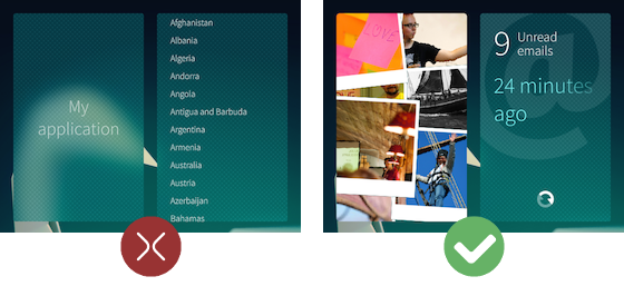
The concept of active covers with cover actions is at the core of the multitasking capabilities of Sailfish OS. It may not seem significant when porting applications to Sailfish, given that Android, iOS and original N9 Meego applications do not have this concept, but it is a very useful way of providing status information or allowing essential app actions to be performed while the app is minimized to the Home screen. An active cover should give a good summary of the application's contents and any open tasks, and provide shortcuts for any common actions such as saving a new item or performing a search.
Non-standard label coloring
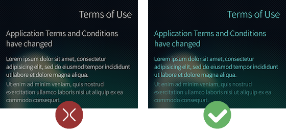
In the Sailfish OS platform style, colors are used to indicate whether a user interface element is interactive. There are some exceptions, but generally buttons, switches, list elements and other items that react to touch input are colored with the primary color, and purely descriptive items like static labels, page and section headers are painted with the ambience's highlight color.
For example, the label below is colored with Theme.highlightColor as it is not interactive:
 Dialog {
     Label {
         color: Theme.highlightColor
         text: "Terms of Use. By selecting Accept you agree to..."
         width: parent.width
     }
 }
Labels and icons should be colored with the highlight color when they are pressed. Below, the first list entry in the image on the left is colored with the primary color even when the item is pressed, which is not consistent with the Sailfish style. On the right, the entry is colored with the highlight color when pressed, as expected:

Silica components with built-in text like Button, ComboBox and ContextMenu will automatically color their text when pressed, but for custom components you will need to implement this effect yourself. For example:
 ListItem {
     id: listItem
     width: parent.width

     Label {
         text: model.text
         color: listItem.highlighted ? Theme.highlightColor : Theme.primaryColor
     }
 }
See the Theme documentation for guidelines on styling press effects.
Incorrect alignment, sizing or spacing
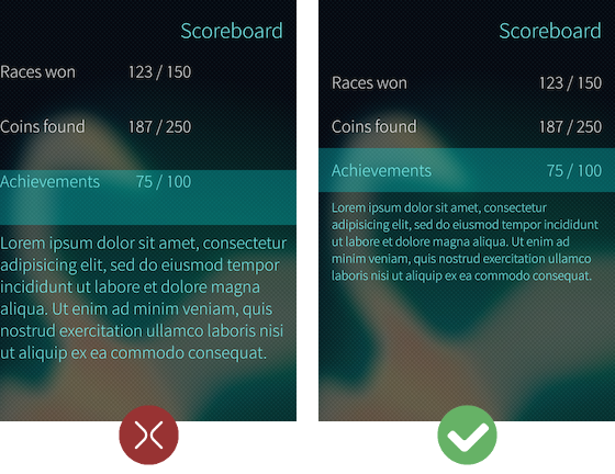
An application's user interface elements and contents should align nicely in the display, and they should be sized consistently with the Sailfish OS style. Using consistent alignment, sizing and spacing is important for visual appeal and readability.
In Sailfish apps, graphics and images are typically aligned flush with the edges of the page (for example, the image displays in Gallery, or album graphics in Media). Textual content and icons within UI controls are typically separated from the page edges, with a margin of Theme.horizontalPageMargin at the left and right screen edges and Theme.paddingLarge at the top and bottom.
Some text-based controls like combo boxes, text fields and page headers already use a content margin of Theme.horizontalPageMargin on their horizontal edges; these can typically be customized via leftMargin and rightMargin properties (for example, the PageHeader leftMargin). When creating your own custom UI items, you will need to add these margins. For example, the Label below anchors itself to the full width of its parent, then sets anchors.leftMargin and anchors.rightMargin as appropriate:
 Page {
     Label {
         text: "A very, very, very long sentence that will extend beyond the width of the screen."
         truncationMode: TruncationMode.Fade
         color: Theme.highlightColor

         anchors {
             left: parent.left
             leftMargin: Theme.horizontalPageMargin
             right: parent.right
             rightMargin: Theme.horizontalPageMargin
             verticalCenter: parent.verticalCenter
         }
     }
 }
User interface elements such as font sizes and list entry items should also be sized correctly and consistently according to the standard Sailfish OS style. This can easily be done with the Theme object, which provides a set of standard sizes, margins and colors for styling Sailfish UI content. See the Theme documentation for details and guidelines.
Touch areas that are too small
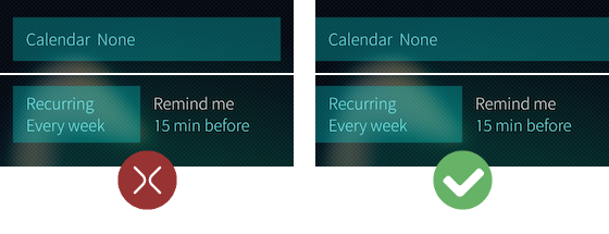
Application developers sometimes have the tendency to create apps with user interface elements that are very small. This is a problem if the elements are interactive, as small touch areas require more cognitive effort to hit successfully. Also, most Sailfish UI components lack visual borders for the interactive area so it is easy to accidentally define incorrectly-sized touch areas.
To maximise the touch areas of items, increase the size of the MouseArea. If an item is laid out in a Row, Column or such, move the spacing from between the items to the inside of the item touch areas. Touchable items should not be smaller than the height of Theme.itemSizeSmall. In fact, most touchable items should be of height Theme.itemSizeMedium or larger, depending on their complexity.
Too many items in the pulley menu
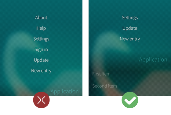
Pulley menus should have a minimal number of options. You wouldn't squeeze 6-8 items into a traditional mobile application toolbar, and the same is true of a Sailfish pulley menu. Most Sailfish platform applications provide only 1-3 pulley menu actions per page. To ensure easy menu access and an uncluttered experience, never show more than four actions in a PullDownMenu or PushUpMenu.
Showing disabled pulley menus
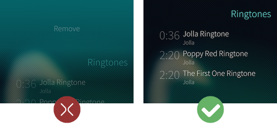
Some pulley menu options may only be supported when certain conditions are fulfilled. If a pulley menu is in a state where it only shows disabled menu items, the whole menu should be hidden from view to avoid showing a menu that cannot be used.
 PullDownMenu {
     MenuItem { text: "Remove" }

     visible: playList.selectionCount > 0
 }
Missing scroll decorators
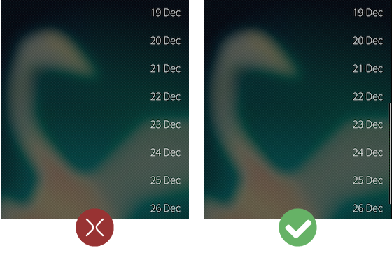
Any view that may accumulate content to the extent that it flows off-screen should include scroll decorators. These indicate the position of the current viewport within the view and hints at the amount of content available off-screen.
 SilicaListView {
     anchors.fill: parent

     VerticalScrollDecorator {}
 }
Using buttons instead of platform-style gestures
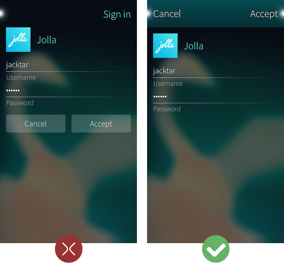
In Sailfish, the "accept" and "cancel" dialog gestures replace the traditional accept and cancel buttons for user confirmation or cancelation. The back-stepping gesture makes traditional back buttons obsolete, and the edge-swipe-to-home gesture makes application "exit" and "home" buttons unnecessary. Also, pulley menus replace traditional application toolbars.
These gestures should be used wherever possible to provide a user experience that is consistent with platform apps. For example, the dialog in the image above right presents the 'Accept' and 'Cancel' buttons provided by DialogHeader, instead of providing separate 'Accept' and 'Cancel' buttons. The button actions can be implemented with the Dialog onAccepted and onRejected signal handlers:
 Dialog {
     onAccepted: account.logIn()
     onRejected: accountCreationCanceled()
 }
Insufficient text editor labeling
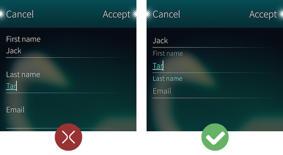
Every Sailfish text editor should define values for the placeholderText and label properties. The placeholder text is displayed when the editor is empty; it describes what the user should enter into the editor. The label has the same purpose, but is displayed after user the has already entered text to the editor. Both properties can use the same descriptive string, such as "First name", "Last name", "Email", and so on.
 Column {
     width: parent.width

     TextField {
         placeholderText: "First name"
         label: "First name"
         width: parent.width
     }
     TextArea {
         placeholderText: "Last name"
         label: "Last name"
         width: parent.width
     }
 }
Missing configuration of the Enter key
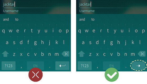
Since the Enter key does not produce new lines in a single-line text editor, this key can be overloaded to perform a custom action for the editor using the EnterKey attached property. Usually, the Enter key is used to move the keyboard focus between successive text fields:
 TextField {
     label: "Username"
     placeholderText: "Username"
     width: parent.width

     // Only allow Enter key to be pressed when text has been entered
     EnterKey.enabled: text.length > 0

     // Show 'next' icon to indicate pressing Enter will move the
     // keyboard focus to the next text field in the page
     EnterKey.iconSource: "image://theme/icon-m-enter-next"

     // When Enter key is pressed, move the keyboard focus to the
     // next field
     EnterKey.onClicked: passwordField.focus = true
 }
If the field is last on the page, the Enter key can also be used to save or send the entered data.
 TextField {
     label: "Password"
     placeholderText: "Password"
     width: parent.width

     EnterKey.enabled: text.length > 0
     EnterKey.iconSource: "image://theme/icon-m-enter-accept"
     EnterKey.onClicked: account.login()
 }
If such actions are not applicable, the Enter key can instead be overloaded to close the on-screen keyboard when clicked.
 TextField {
     label: "Password"
     placeholderText: "Password"
     width: parent.width

     EnterKey.iconSource: "image://theme/icon-m-enter-close"
     EnterKey.onClicked: focus = false
 }
Unwieldy page hierarchies
While the application page stack allows users to easily move back and forth between different screens in your app, if the page stack has a deep hierarchy, the user may become confused as to where the current screen sits within the application. Instead of continually pushing more pages onto the stack, consider replacing pages using replace(). For example, the platform Maps application's in-app search replaces the existing search pages instead of pushing new ones to avoid an unwieldy (and in theory infinitely growing) page stack hierarchy.
Scaling Sailfish Application UIs Sailfish Silica Reference