API Documentation
Documentation for developing SailfishOS applicationsPullDownMenu QML Type
Adds a pull-down menu to a flickable Silica view More...
| Import Statement: | import Sailfish.Silica 1.0 |
Properties
- active : bool
- background : Component
- backgroundColor : color
- bottomMargin : real
- busy : bool
- flickable : Item
- highlightColor : color
- quickSelect : bool
- spacing : real
- topMargin : real
Methods
- cancelBounceBack()
- close(bool immediate)
Detailed Description
A PullDownMenu provides global actions for a SilicaFlickable, SilicaListView, or SilicaGridView. The menu is positioned above the content of the view and is accessed by dragging the view down. The menu items are activated by either:
- dragging the view down to highlight a menu item and releasing to activate
- dragging or flicking to expose the entire menu, and tapping a menu item to activate
A PullDownMenu is populated with options by declaring MenuItem objects as children of the PullDownMenu. It can also include MenuLabel children to display non-interactive labels.
 import QtQuick 2.2
 import Sailfish.Silica 1.0

 ApplicationWindow {
     initialPage: Page {
         SilicaListView {
             PullDownMenu {
                 MenuItem {
                     text: "Option 1"
                     onClicked: console.log("Clicked option 1")
                 }
                 MenuItem {
                     text: "Option 2"
                     onClicked: console.log("Clicked option 2")
                 }
                 MenuLabel { text: "Informational label" }
             }

             anchors.fill: parent
             header: PageHeader { title: "Header" }
             model: 100
             delegate: ListItem {
                 Label {
                     text: "Item " + model.index
                     anchors.centerIn: parent
                 }
             }
         }
     }
 }
Note that a SilicaFlickable, SilicaListView, or SilicaGridView is required to use a PullDownMenu. A menu can easily be added to any page by introducing a SilicaFlickable:
 // Without a PullDownMenu
 Page {
     Column {
         width: parent.width

         PageHeader {}
         Slider { width: parent.width }
     }
 }
 // With a PullDownMenu
 Page {
     SilicaFlickable {
         anchors.fill: parent
         contentHeight: column.height

         PullDownMenu {
             MenuItem {
                 text: "Option 1"
                 onClicked: console.log("Clicked option 1")
             }
         }

         Column {
             id: column
             width: parent.width

             PageHeader {}
             Slider { width: parent.width }
         }
     }
 }
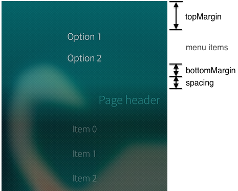
The PullDownMenu has customizable margins and background.
The background and colors of a PullDownMenu can be customized by changing the background and backgroundColor. The sizes of the margins and menu item spacing are also customizable. The sizes are applied as follows:

PullDownMenu and PushUpMenu can be used together to provide menus at both the beginning and end of a view.
See also MenuItem, PushUpMenu, and ContextMenu.
Property Documentation
A PullDownMenu is active if it is partially or completely visible.
This property holds the component to use to draw the background of the menu. It is recommended that the background excludes the spacing at the bottom of the menu, for example:
 PullDownMenu {
     background: Rectangle {
         anchors {
             fill: parent
             bottomMargin: parent.spacing
         }
         opacity: Theme.highlightBackgroundOpacity
         color: Theme.highlightColor
     }
}This property controls the background color of the menu. It is painted with a gradient applied.
See also highlightColor.
This property holds the margin between the last menu item and the menu indicator.
The default value takes into account the presence of any MenuLabel at the end of the menu. If the last child in the menu is a MenuLabel, this value is 0, otherwise it is the height of a MenuLabel. This provides a similar menu opening feel for menus with and without a MenuLabel.
Pulses the menu indicator to indicate that an operation is in progress. The menu can still be accessed while busy is true.
Specifies the SilicaFlickable, SilicaListView, or SilicaGridView to which the PullDownMenu will be added.
If flickable is not supplied then the menu will be added to the nearest ancestor Flickable.
This property controls the color of the menu indicator and menu highlight bar.
See also backgroundColor.
When true, quickSelect prevents locking the menu open when the end is reached in menus with a single option.
This allows the user to drag the menu all the way open and release to select the menu item. This is most useful in alarm type dialogs, where the menu has a single option which the user will likely want to react to very quickly, or without seeing/hearing the menu interaction at all.
This property holds the number of pixels to reserve between the menu indicator and the view content.
The default value is 0.
See also topMargin and bottomMargin.
This property holds the margin between the top of the menu and the first menu item.
The default value is Theme.itemSizeSmall.
See also bottomMargin and spacing.
Method Documentation
Normally after a menu item is selected, the PullDownMenu will perform a short 'bounce-back' animation to return to the closed state. However, this may interfere with the action desired as a result of menu selection. To prevent the bounce-back animation after item selection, invoke cancelBounceBack() from the onClicked handler of the relevant menu item. The bounce-back animation will be re-enabled the next time the menu is opened.
See also close.
Closes the menu.
By default, the menu closing operation is animated by a short 'bounce-back' animation. However, if immediate is true, the animation will be omitted.
See also cancelBounceBack.